50 Best 404 Page Examples: Smart, Funny, And Inspiring
We’ve all seen it from time to time – 404: Page Not Found – three dreaded numbers and words informing you that the URL you clicked on does not exist in a website’s directory. Error pages are generally seen as a deferring point for site visitors and is a common drop-off point for them – for nearly 74% of people, in fact. But did you know that with a bit of creativity and fun redirecting, you can reduce your website bounce rate?
In this article, let’s take a look at what 404 pages are, their purpose, and why you should care about how yours look and function. We’ll also take a look at cool, funny, branded page designs for inspiration.
What is a 404 error page?
A 404 error page is a page telling you that the link or URL you have typed in does not exist. This kind of page is a placeholder for broken links on a website – it also comes up when a URL is mistyped. An error page is also integral for overall website crawlability in SEO.
Why should you care about its design?
So you might be thinking “Wait. Isn’t an error page just an error page? It does its job, so what more does it need?” Right, it does. But remember, a 404 error page is a common place where users drop off of your website – so you can seize the opportunity to redirect visitors back to your website with an eye-catching design or alternative page suggestions.
What should your 404 page be like?
Remember, with easy-to-use navigation and clear calls-to-action, well-designed error pages allow visitors to better navigate your website. Be sure to include the following features to ensure a smoother user experience:
- A homepage link
- A sitemap link
- A hard-to-miss search bar
- Links to popular items or articles
These elements all decrease the frustration or feeling of hitting a dead end with a wrong URL or link, in turn ensuring people stay on your website longer.
How to create a 404 page
If you think you’re ready to get hands-on with your error pages, reach out to your graphic designer or website developer, as these two people would be responsible for creating 404 pages for your website. Gather up your copywriters as well (you’re gonna need some word wits for this). Your visual and tech teams can use CSS tricks and different video or image editors to build a unique page while the writers can craft something fun and memorable.
If you’re using a ready-made store design in AliDropship, check your store’s theme settings.
[]
AliDropship’s themes allow you to customize your 404 pages by adding your own text and images. And if you feel you need some web design inspiration to get started, just keep scrolling.
Best 404 page examples (and what makes them so great)
Error pages are like stop lights on the road. They are red, but you have to think of fun ways to change the light to green. One common point of all good 404 pages? They have a great navigation. Take a look:
-
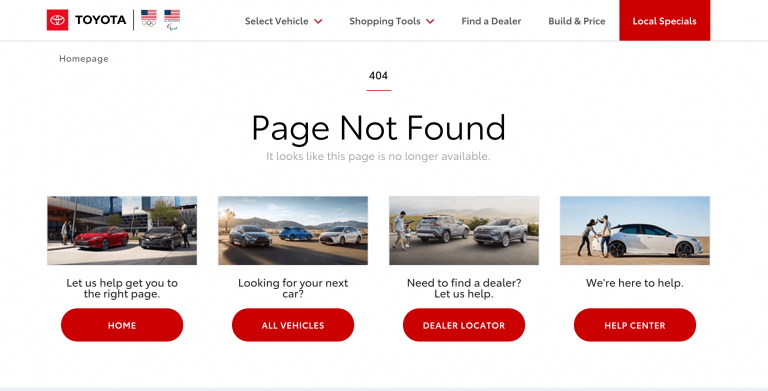
Toyota USA
The automaker displays four calls-to-action to get visitors going to where they need to be.
-
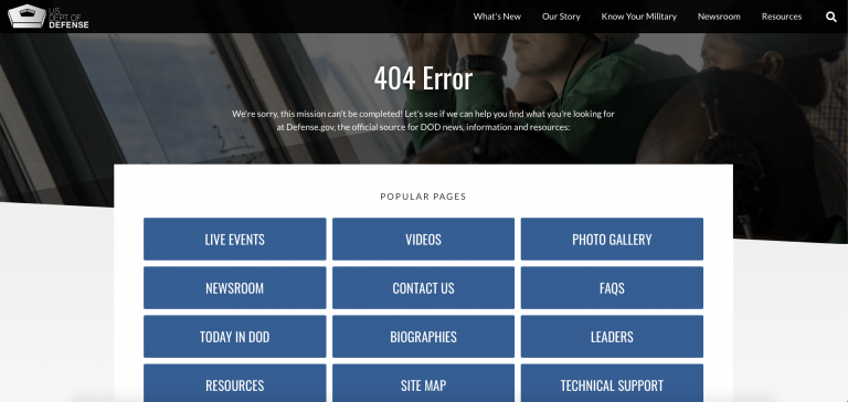
US Department of Defense
The government website shows a plethora of popular pages to redirect visitors to highly-visited pages.
-
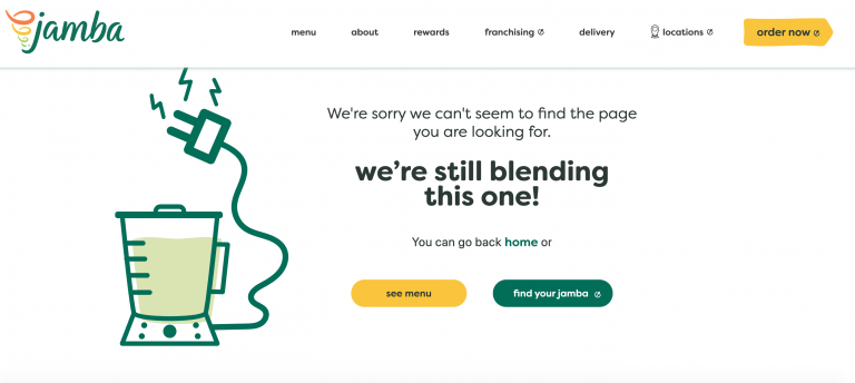
Jamba Juice
No page doesn’t mean no drinks. Beverage chain Jamba Juice informs visitors who stumble upon its error page that they are still “blending.” A menu and store locator are offered as alternatives so visitors can navigate to elsewhere on the website.
-
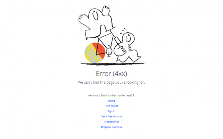
Dropbox
With a funny illustration (we’re not sure what it is either) and a straight-forward dropdown of links (including a homepage and sign-in link), the file hosting giant makes rerouting a breeze.
-
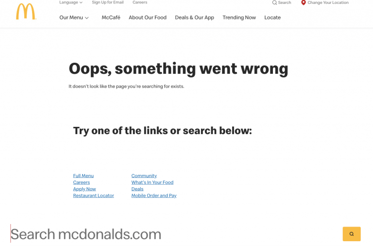
McDonald’s
Although there is no picture of a mouth-watering burger (we’re honestly surprised), the global fast food giant serves up a large search bar and menu of link options to ensure visitors have easy navigation to where they need to be.
-
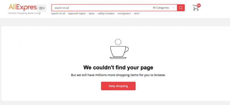
AliExpress
AliExpress uses copy to prompt visitors to shop with a “Keep shopping” button. The button takes the user to the website homepage where there are a ton of categories to choose from (so they won’t have to worry about not finding what they originally visited for).
-
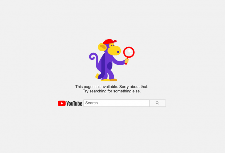
YouTube
A cute little illustration with a simple message point users to a prominent search bar to look for something else.
-
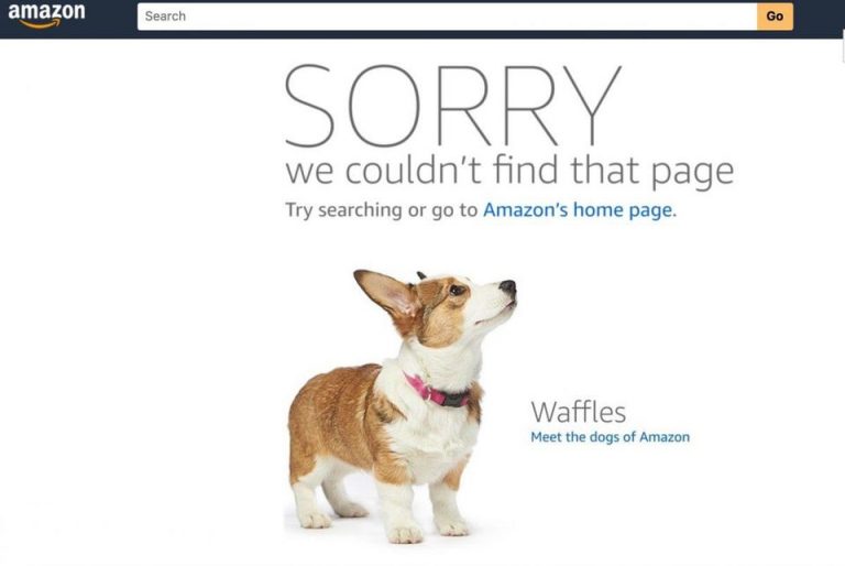
Amazon
Taking a page from the branding book, Amazon fluffied up its error pages with its company dogs, which are a huge part of its company culture.
-
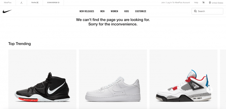
Nike
The sportswear giant utilizes the space on its 404 page to point out popular products in hopes of getting visitors to click and visit other pages on the website.
-
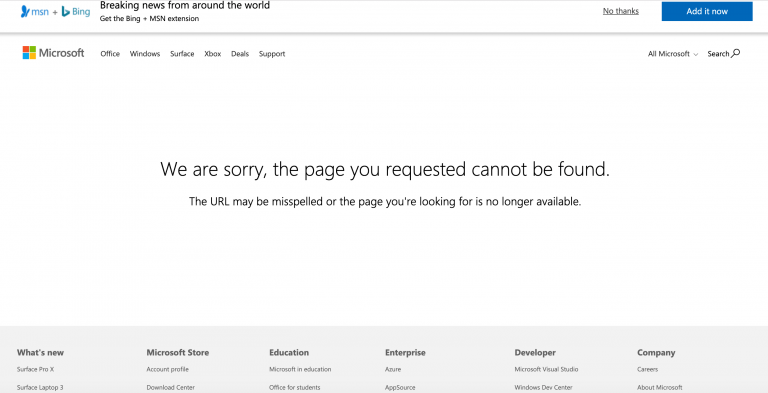
Microsoft
The software giant sets up a very straight-forward error page, but ensures its bottom navigation menu is visible so visitors who accidentally stumble upon this page can navigate their way out.
-
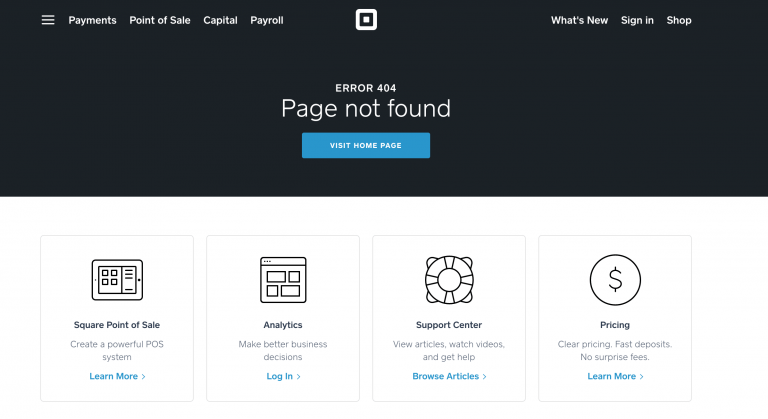
Square
The mobile pay company is straight-forward with its copy, but provides links to articles, a user log-in, and more pricing info, making the 404 page a useful destination.
-
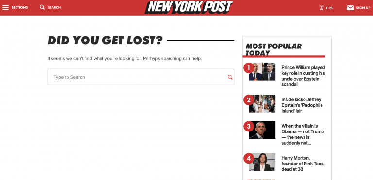
New York Post
Wrong URL? No problem. The New York Post keeps readers and visitors well on their way with a search bar and a sidebar featuring popular stories. The easy navigation increases the chances of visitors clicking into other pages of the website, decreasing the bounce rate.
-
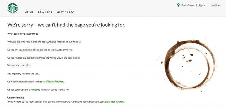
Starbucks
With a coffee cup stain, the international coffee chain shows that there is nothing on this page (and definitely no coffee). The java giant presents visitors with a logical approach to the 404 page, offering up explanations as to what could have caused the 404 page, in addition to easy solutions. What is cool is Starbucks also has a link letting users leave feedback about broken links – this shows users that the company values and welcomes feedback.
-
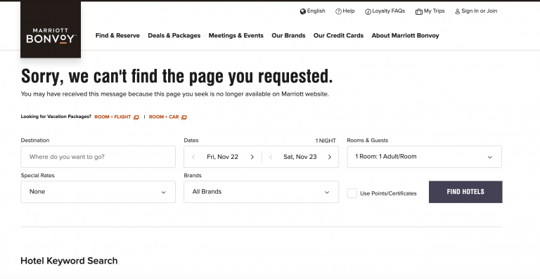
Marriot
Hotel-chain operator Marriot provides on-the-spot convenience on its 404 page by offering fields for users to enter their stay information to get the travel information they need.
-
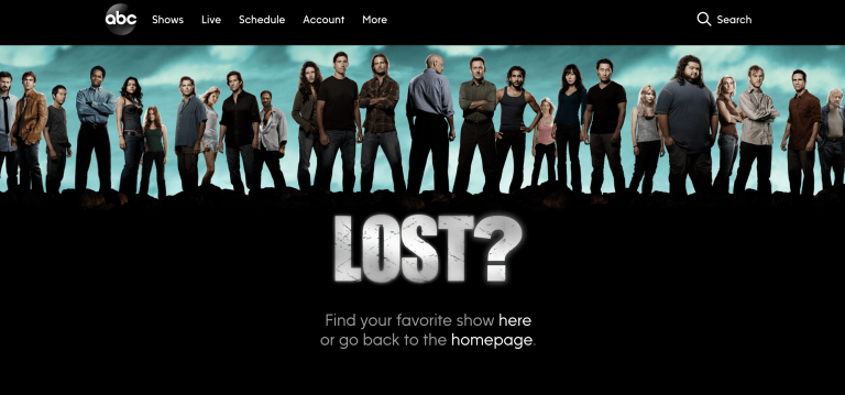
ABC
The American television network plays with words, using “Lost,” one of its most popular TV series, to describe the site visitor’s mistake. A few simple links are on the page allowing visitors to find a show they are looking for or a homepage link to get them to the front of everything.
-
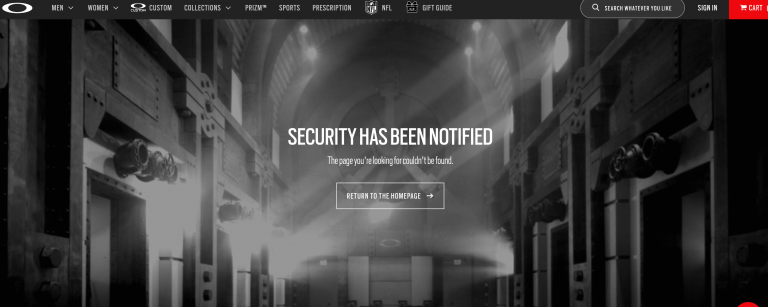
Oakley
Keeping its cool image, Oakley jokes that security will be notified of your 404 error.
-
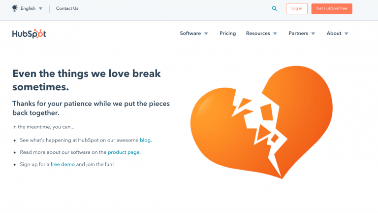
Hubspot
When in doubt, go for the heart. Hubspot expresses its sadness with a broken heart on its error page while directing traffic to its products, blogs, and a demo of its services.
-
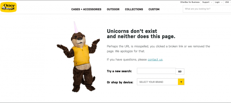
Otterbox
When all else fails, just shrug it off. Phone case manufacturer Otterbox places its otter mascot on its error page to shake off the mistake while offering a search bar and shopping category dropdown box for easy solutions.
-
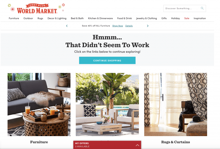
Cost Plus World Market
You can find just about anything at this international-goods retailer – just not a wrong page! Cost Plus World Market directs customers to a wrong URL to continue their shopping with a homepage link or immediate categories, even utilizing offers on the spot for incentive to click.
-
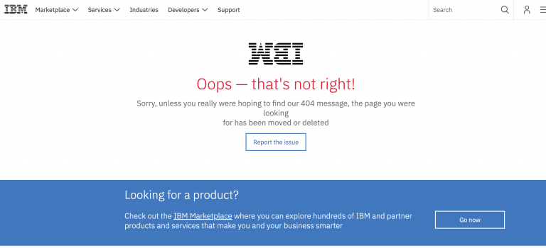
IBM
American tech giant IBM keeps its error page straight and simple, allowing users to either report the error or go to its products landing page.
-
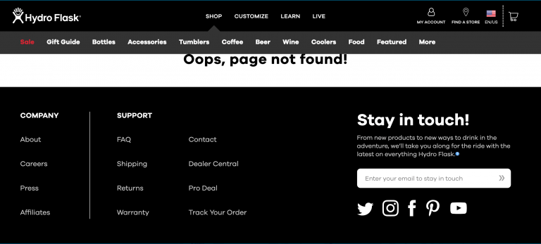
Hydroflask
The maker of the super popular insulated water bottle keeps its error page short and simple. The company minimizes its page’s blank space and instead uses the real estate to ensure its bottom navigation and social media handles are most prominent for a higher possibility of customer clickthrough.
-
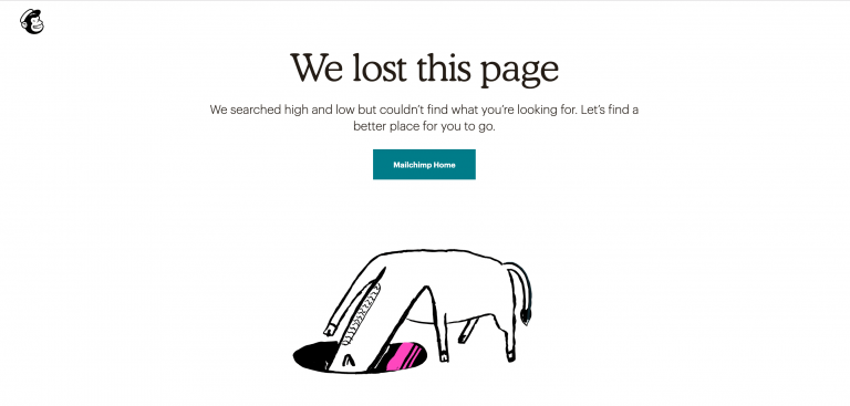
MailChimp
With one simple redirect to the homepage, MailChimp owns up to “losing” a page and illustrates the mistake with an animation of a horse digging into a hole to nowhere. The page combines some humor with a direct call-to-action.
-
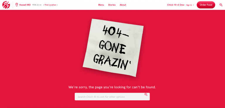
Chick-Fil-A
The American-based fast food joint carries its brand voice from its ad campaigns with cows – and notes that cows are missing in the 404 page. A search bar completes the layout to let customers get to where they need to be.
-
Kenneth Cole
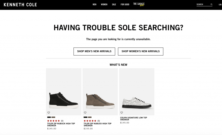
We’re seeing a pattern of brand voice (and fun puns). Kenneth Cole plays off of words with “sole searching” in its error page message (since the brand is most known for its shoes) while showing a selection of new products to entice shoppers in addition to other shopping categories.
-
Chase
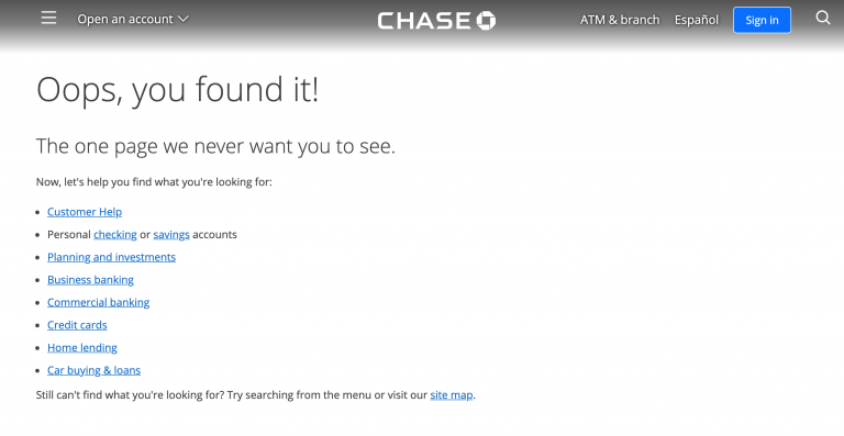
The American bank chain pokes a bit of fun at the page error while maintaining its approachable and friendly service demeanor, offering a plethora of easy options to get customers going with their errands. It also offers up a link to its site map for all visibility in case a customer needs something not shown.
Funny 404 page examples (and why they work so well)
Aside from redirecting traffic, 404 pages are an unexpected way to poke fun at user error or bring some brand personality to your website. From big entertainment giants to fast-paced ecommerce sites, it never hurts to have a little fun (just ensure you are redirecting traffic correctly). Let’s take a look at how some companies do a great job at this:
-
Disneyland Paris
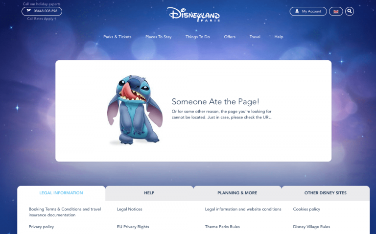
The website for the French version of the “Happiest Place on Earth” lets Stitch from 2002’s “Lilo & Stitch” take the blame for a faulty page. The page features clickable, informative tabs right below the error message, ensuring website visitors find the information they need in a glance. Plus, a dreamy purple background makes us think Disney did its homework on color psychology (purple is associated with creativity and… you guessed it – magic).
-
American Airlines
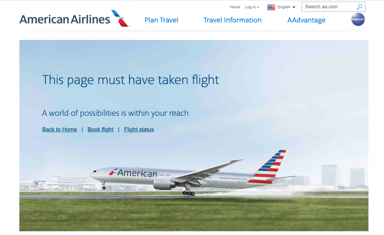
A tongue-in-cheek header and three click-and-go links get travelers to their intended destination quickly.
-
Yelp
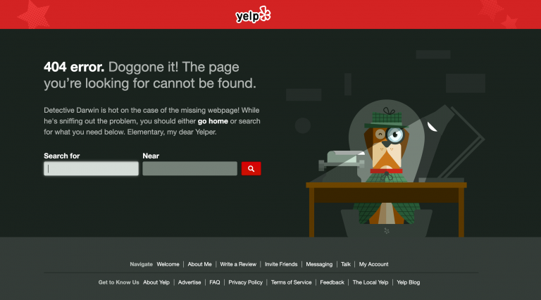
The international review community for food and businesses uses a created character to add some spunk and fun to its 404 pages. Detective Darwin is on the case of the wrong URL – while you the visitor have a direct search bar and ZIP code field to find what you are looking for.
-
AMC Theatres
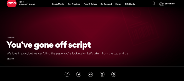
The American cinema chain gets quirky with movie-making lingo, presenting a great example of a 404 page with brand voice and personality.
-
Marvel
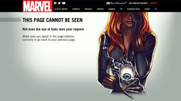
Utilizing The Watcher, a famous Marvel figure, the comic giant plays on metaphors in copy to tell users that their page is unseen.
-
Virgin Atlantic
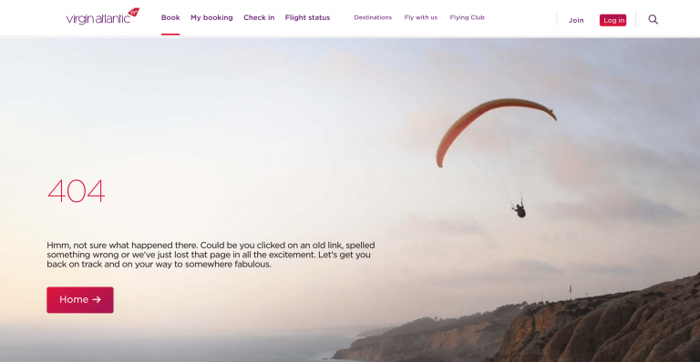
Another airline that uses fun, vivid language is Virgin Atlantic. The airliner speaks of a 404 page getting “lost” in all the excitement of travel.
-
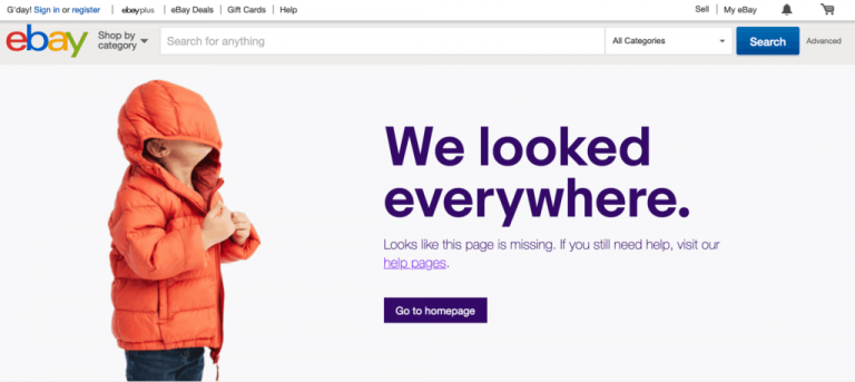
eBay
The online bidding king cleverly juxtapositions copy and an image of a child with a hood covering his eyes to convey the feeling of not being able to find anything. A call-to-action to the eBay homepage and help pages ensures visitors get the assistance they need.
-
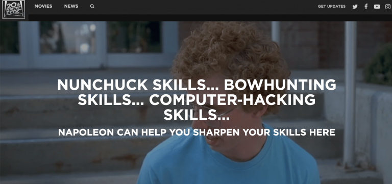
20th Century Fox
The Los Angeles-based movie studio ups its creative juices with video clips from some of its hit movies. In this example, 2004 indie film “Napoleоn Dynamite” takes center stage with funny quotes that relate to the movie. This creates an interactive and fun customer experience, despite visitors stumbling upon a nonexistent page.
-
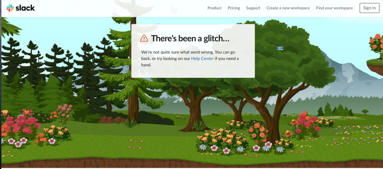
Slack
The chat app maker gets clever, creating a repeated background of greenery to tie in with its message of there being a glitch on the page (note: a glitch is usually illustrated by the same images/objects repeating in one place).
-
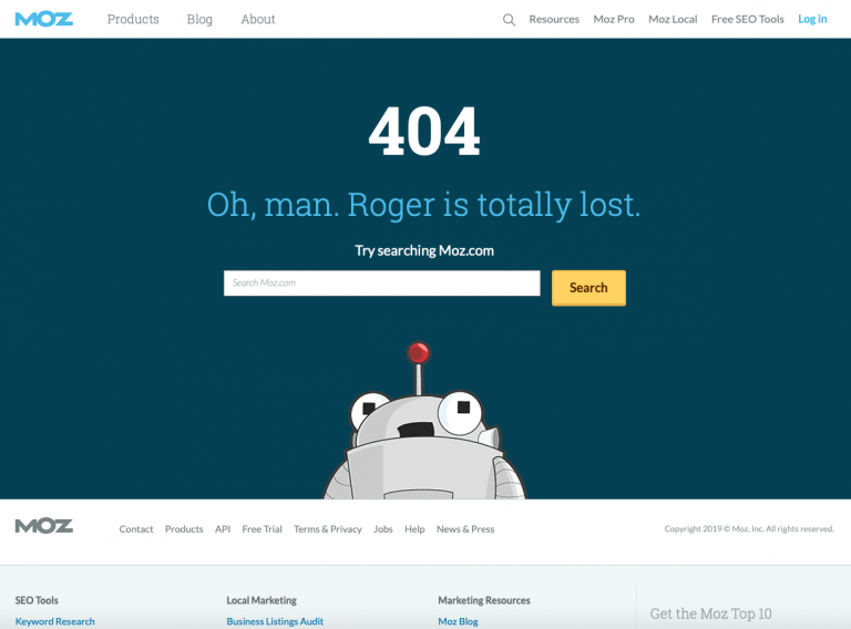
Moz
The SEO powerhouse pokes fun of its robot mascot and offers a search function for users, creating a funny yet useful page.
-
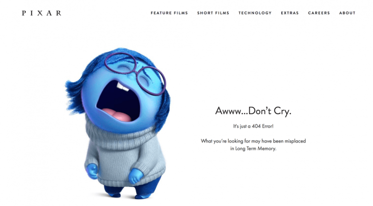
Pixar
Cry cry. Pixar pokes fun of The Sadness, a character from its 2015 film “Inside Out,” while referencing “long term memory,” a major element of the animated flick.
-
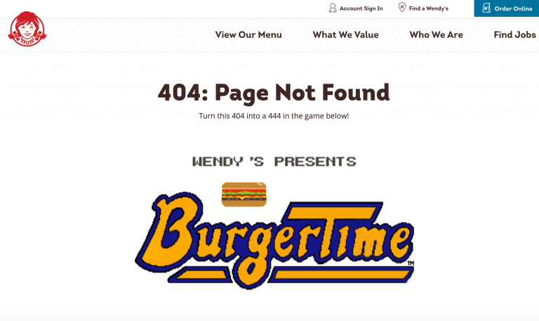
Wendy’s
Known for its fiery personality on social media, it’s no surprise that the American fast food joint implemented an entire GAME into its 404 page. To play the game, you have to tap your keyboard arrow keys to start.
-
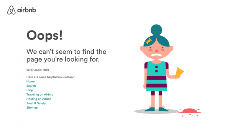
Airbnb
A funny illustration, coupled with a menu of links, helps the property-rental magnate quickly get customers to where they need to be.
-
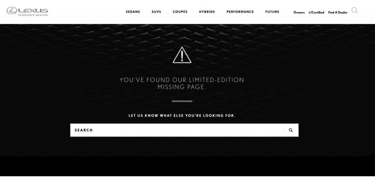
Lexus
The Japanese luxury car brand creates an element of exclusivity with its error pages before prompting visitors to utilize a search bar.
-
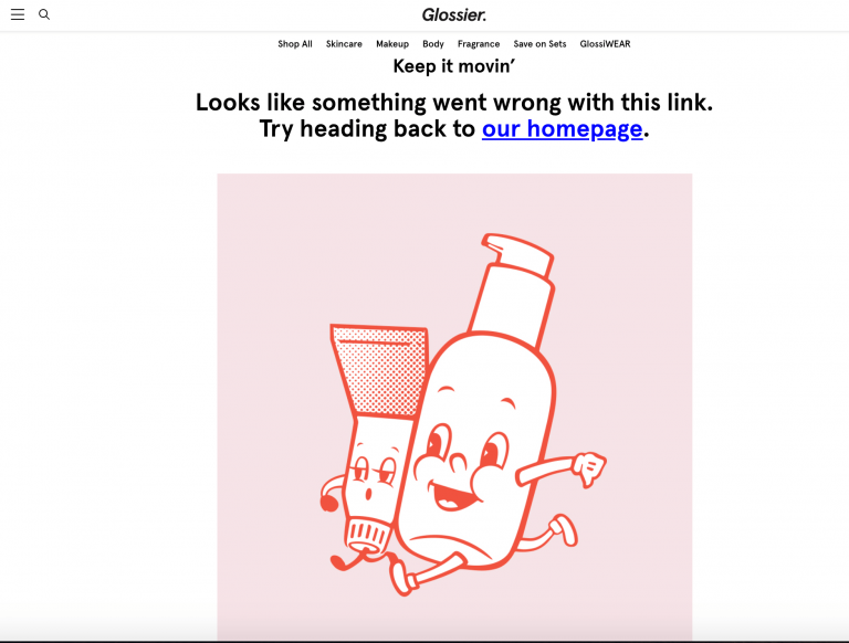
Glossier
The booming skincare and cosmetics company recruits two cute products to illustrate its point: get moving (with a convenient homepage link in large font).
-
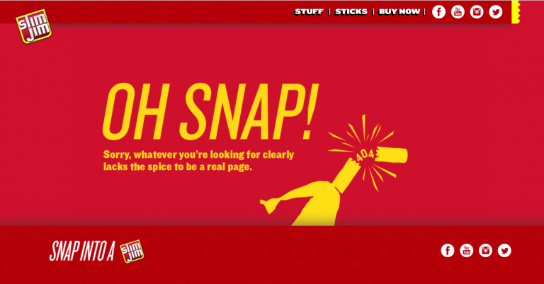
Slim Jim
Capitalizing on its tagline “Snap into a Slim Jim,” the American beef jerky giant uses puns to make a joke.
-
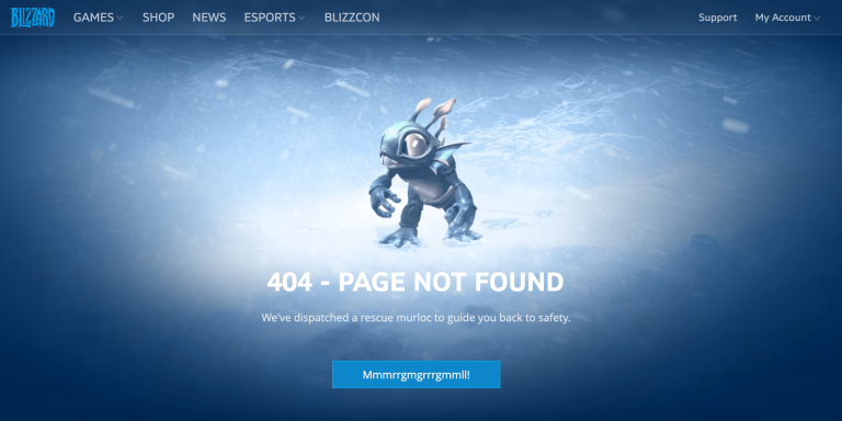
Blizzard Entertainment
Utilizing an animated game character, this gaming developer uses fun copy and movement for some personality.
-
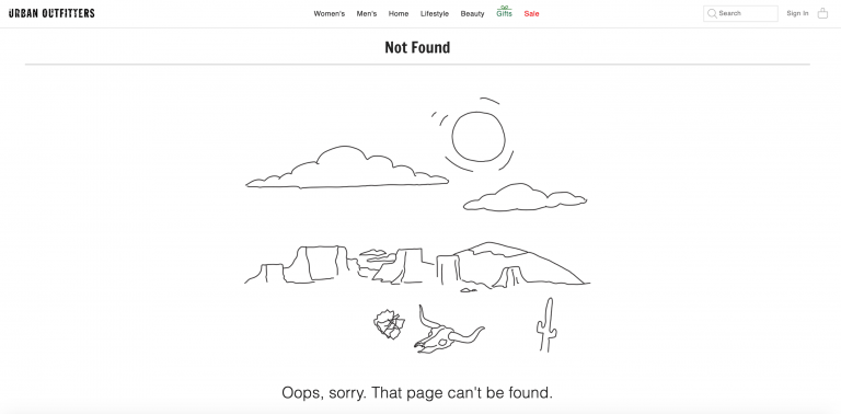
Urban Outfitters
Illustrating that there is absolutely nothing there, Urban Outfitters adds an animated sketch of a desert to get its point across. Interestingly enough, there are no quick links anywhere except on the top navigation.
-
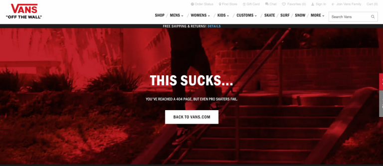
Vans
Referencing its skate culture and target demographic, Vans plays on sympathy, letting users know it’s ok that they made a mistake landing upon a 404 page and to go back to the website homepage.
-
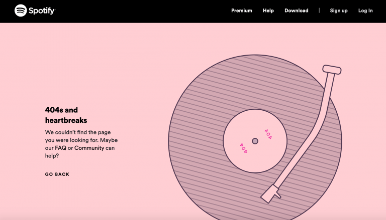
Spotify
A broken page is like a broken record, right? Music streaming service Spotify illustrates error-page sadness with “404s and heartbreaks” and a 404 record.
-
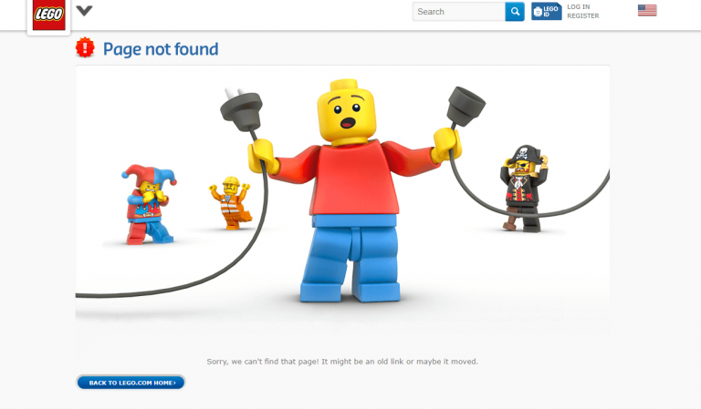
Lego
Some fun characters and a metaphoric illustration add humor (and reduce frustration) for users who stumble upon a non-existent page for Lego. Can’t blame a technical error on a couple of toys, right?
-
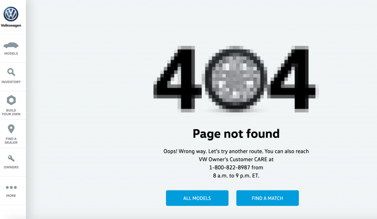
Volkswagen
The German vehicle manufacturer plays on driving lingo to convey a sense of a roadblock to steer customers back in the right direction, offering two quick-click calls-to-action.
-
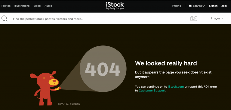
iStock
iStock shines the light (quite literally) on the dreaded 404 number while joking about its lack of ability to find what the user is looking for. The dog illustration is even available for purchase on its website – how smart is that? Utilizing every bit of its error page real estate.
-
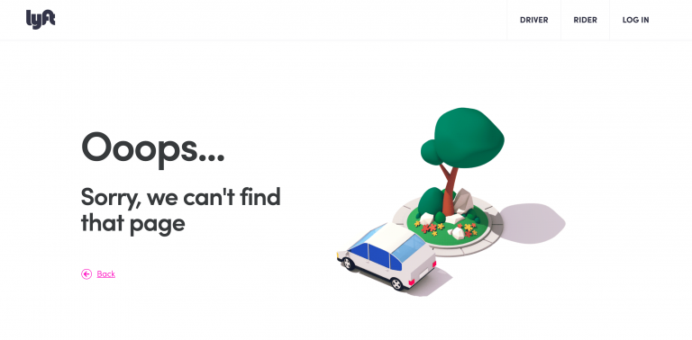
Lyft
Ridesharing can be a pain. But so can stumbling upon a wrong page. Ride-share operator Lyft plays on this misfortune with an animated car that drives in circles around a tree.
-
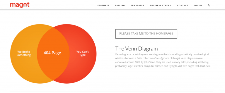
Magnt
Website builder Magnt gets cheeky with a diagram and copy pointing out that user error (hello, typos) and broken page links (Magnt’s fault) are equally at fault for a 404 error page. This is a great example of a brand poking fun at itself while showing a relation to its audience.
SUMMARY
Error pages are informative placeholders in your website structure for invalid URLs. With some strategy and creativity, a custom 404 page can be a great opportunity for redirecting traffic to other pages of your website, in the process gaining you potential customers while showing some brand personality.

tutorials and special offers from AliDropship


HI,
Impressive Article. Thanks for sharing this wonderful information.
Thanks,
Olivia